As project managers, we all know how important it is to get your capital & infrastructure projects done on time. Proper time and schedule management helps get things done fast and boosts productivity.
However, in a program of works or large portfolio, I can’t help but ask: to Gantt or not to Gantt?
Gantts are a necessary evil for projects to get the job done
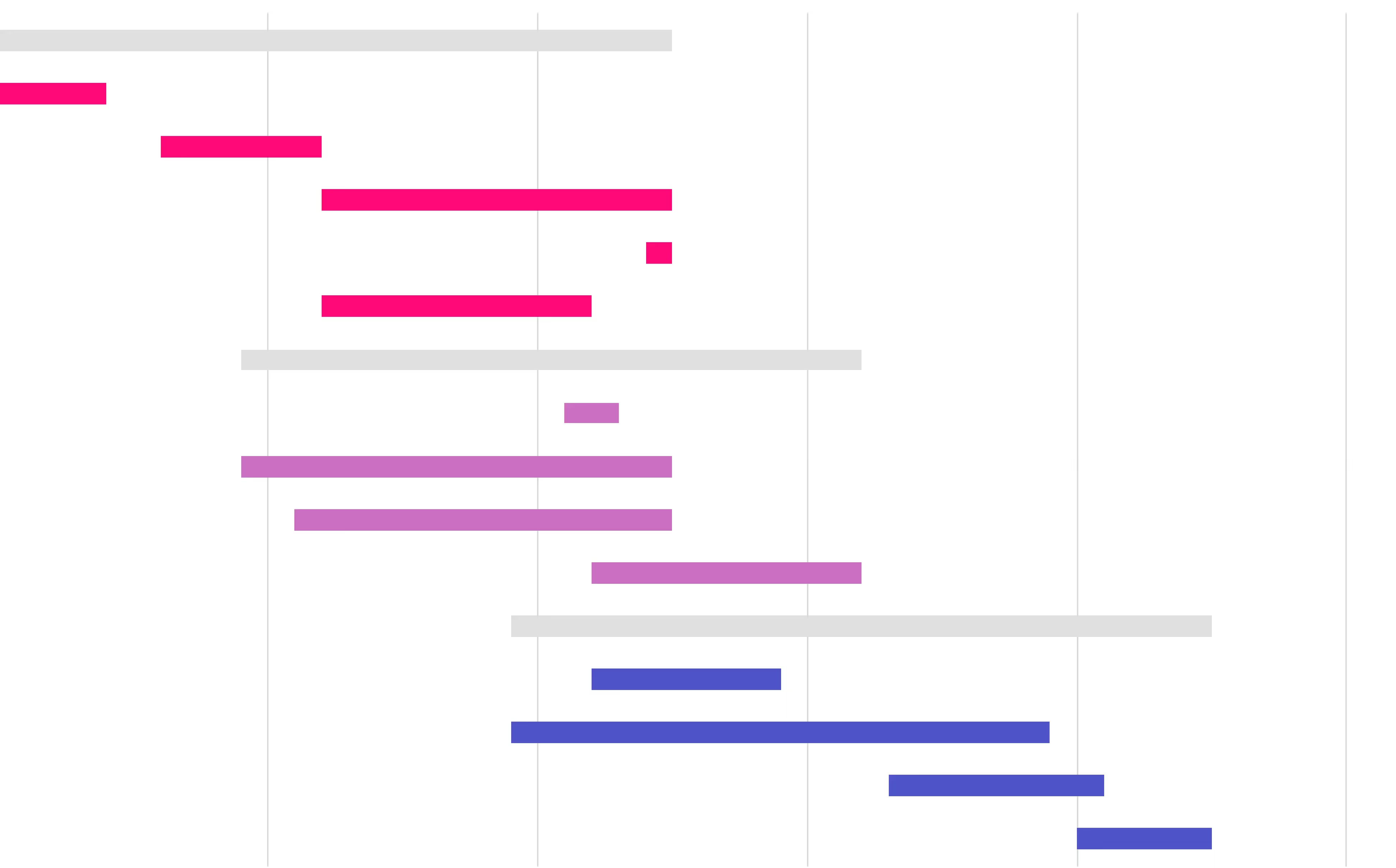
Gantt charts are like a pencil. You use them to do a drawing, but you don’t really look at the pencil after you get the job done. You look at the artwork that you used the pencil to make.
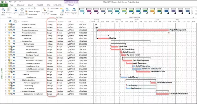
Still, Gantt charts are the preferred project management pencil that helps client-side PMs and capital asset owners visualise project timelines, tasks and interdependencies. Most people use Microsoft Project, or if you are a mad scientist and want to spend your budget, Oracle Primavera.
It's easy to see the value of these tools for the project manager driving a project to completion. They tells you:
- Sequential activities & critical path
- Which tasks are completed
- What's to come
- What’s in progress

This visibility allows client-side project managers to allocate time and responsibility accordingly. Using Microsoft Project or Primavera is a good tool available to the Project Manager to do their job, and they will always need one or the other.
What about my program or portfolio?
I remember waiting each month in my role as a Program Manager, for those project control group or monthly reports to come in. And when they came, in the back of them, was 10 pages of A3 Gantt charts.
That means across a program with 10+ projects was 100+ pages of A3 Gantt chart documents to review. This was like looking at 10 pencils. What joy!
Without everything in the same place, it became very difficult in a growing program to report to my client and answer questions like:
- which key milestones are completed
- what key milestones are to come
- what key milestones are in progress
I wanted to know which key milestones I needed to deconflict.
I didn’t want to see the pencil I used to draw, I wanted to see the drawing.
Why?
Imagine having 5 projects closing tenders on the same week. That would cause a heap of work in a short period of time. Or having projects going out to market for tenders to the same contractors, having the same submission dates. Not only does it put a heap fo stress on the market, but it also gives lower quality responses.
Gantt charts just can't give me what I need to avoid the above situations. I wanted a simple view of the projects lifecycle in one place. I needed real-time visibility on the program’s key project lifecycle milestones that I was accountable for. A lot of the time, it looks like this - a fixed template or drumbeat that every project reports on.
Go on...say Gantt in my PMO one more time!!!!
Say it... I dare you. Getting rid of Gantt charts all together in a program is a wise move. It's time to save your Project Manager’s time, trust them to use the pencil in the right way and give you a report on the key project lifecycle milestones.
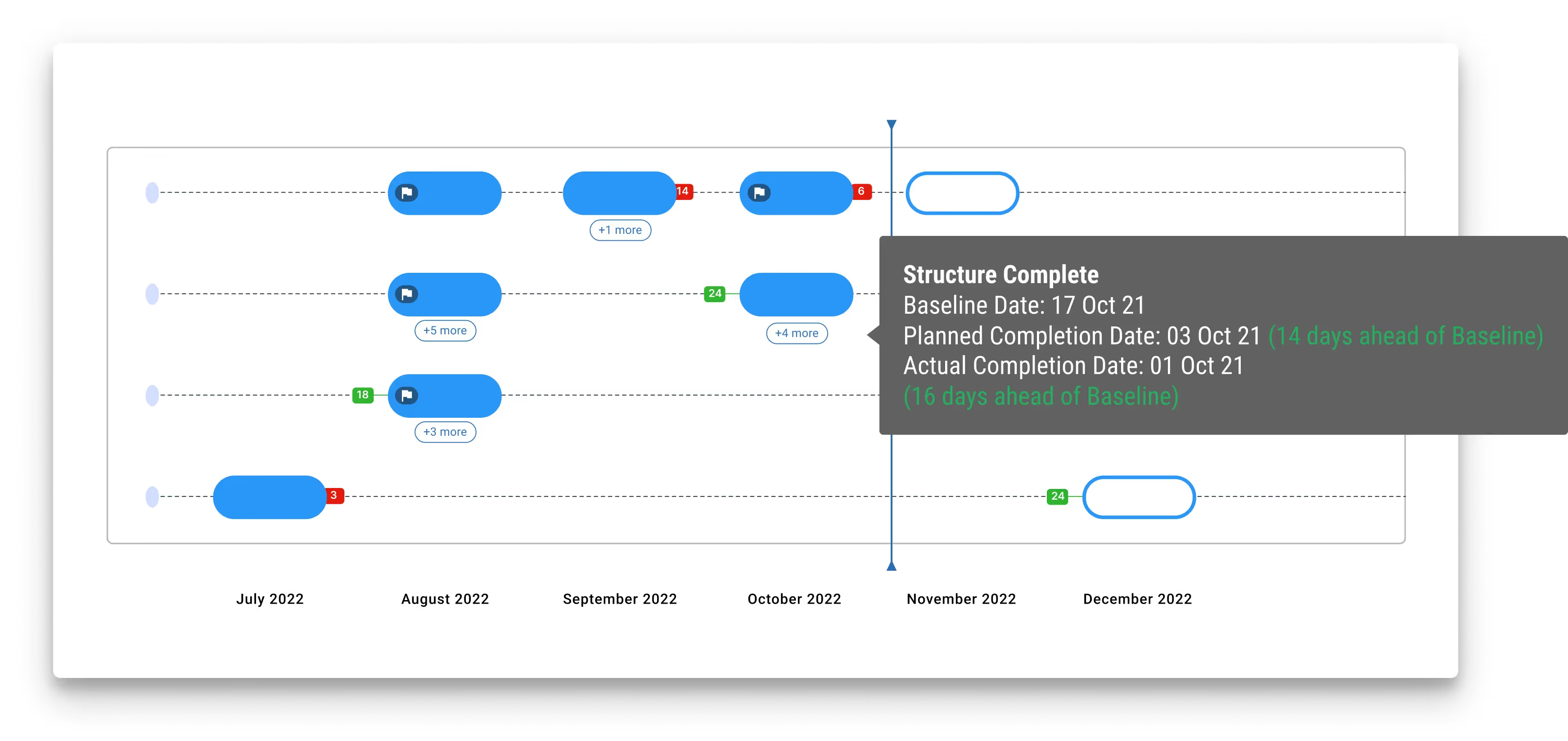
Standardised and consistent key project lifecycle reporting makes life easy in viewing and aggregating data into a Program. Suddenly, it was off to the races - literally! Horizontally inverting the lifecycle and stacking them on top of each other gave us the amazing ‘Racehorse’ view, just like at the arcade!

All milestones are presented on a single page, with deep visuals on completion, in progress and planned versus actual dates. I was able to see quickly and easily my program of works, turning my job from boring administration into proactive program management.
Gantt in a Project, but Racehorse a Program
Just like the arcade, there is also a time and cost payoff in managing schedule in the Racehorse method:
- It saves hours aggregating Gantt charts.
- It allows you to see in real-time all of the projects.
- Project Managers can take decisions fast around project interdependencies or de-conflictions.
The Racehorse method establishes clear and proper program governance, forcing us to ask:
- Are all my projects operating on the same drumbeat?
- Is my program’s governance and compliance being followed?
- Am I properly collecting data on the key milestones that I am needing to report on?
- Which projects in my program are under performing or need assistance?
The Racehorse method establishes a standardised practice around collecting data, now that across a program of work we can benchmark baseline, planned and actual dates to measure performance.
With a relatively small set of data, the Racehorse method also sets up for deep machine learning and analytics to drive future project decision making and planning, unlocking the value of data that was previously trapped in tens of thousands of Gantt chart rows.
.avif)
Conclusion
There are tons of Gantt chart program management software on the market that you can try out at a project level, and you will always need a tool in project management to assess critical path and confidently identify dates for those key project lifecycle milestones.
However, if you’re managing a Program of works you need a fast, easy and standardised way of identifying project status and cross program interdependencies - time to enter the Racehorse. And where to find it?
We’ve got you covered. Mastt’s new Program Schedule tool is our latest addition to the Mastt suite of capital project/program/portfolio management tools. You can now view and understand the status of each milestone across the program over time, which makes assessing the performance of all projects in a single view easier than ever.

If you are curious, and want to be among the first to see it in action, keep an eye on our upcoming webinars. We're doing one to introduce the module very soon.


.avif)


